Brand alignment: The catalyst for change
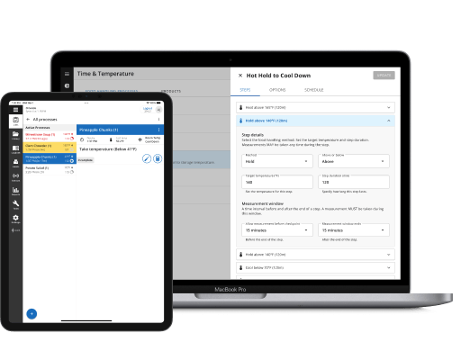
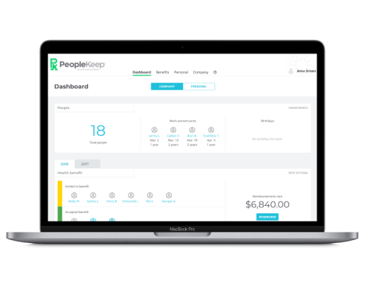
PeopleKeep, an HRIS software provider for SMBs, faced a challenge: their app’s design had grown messy over time. With 172 auto-generated colors and inconsistent design patterns, the app didn’t match their new brand. I was contracted to align the app’s look with PeopleKeep’s new brand identity in just three weeks.
Deep dive: Finding opportunities to improve
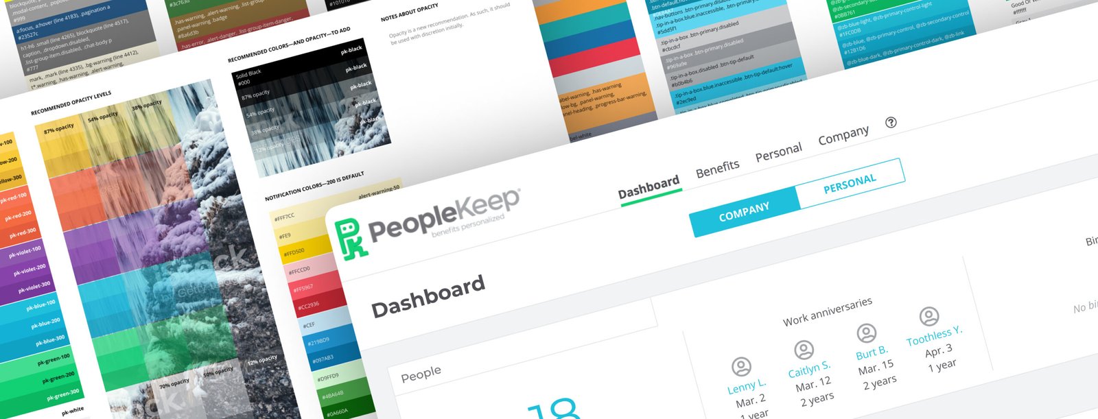
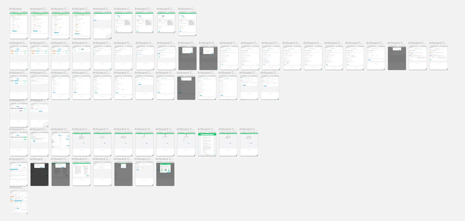
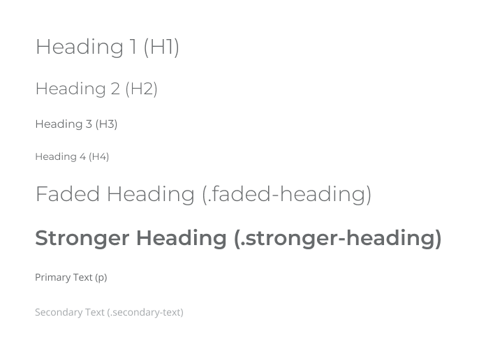
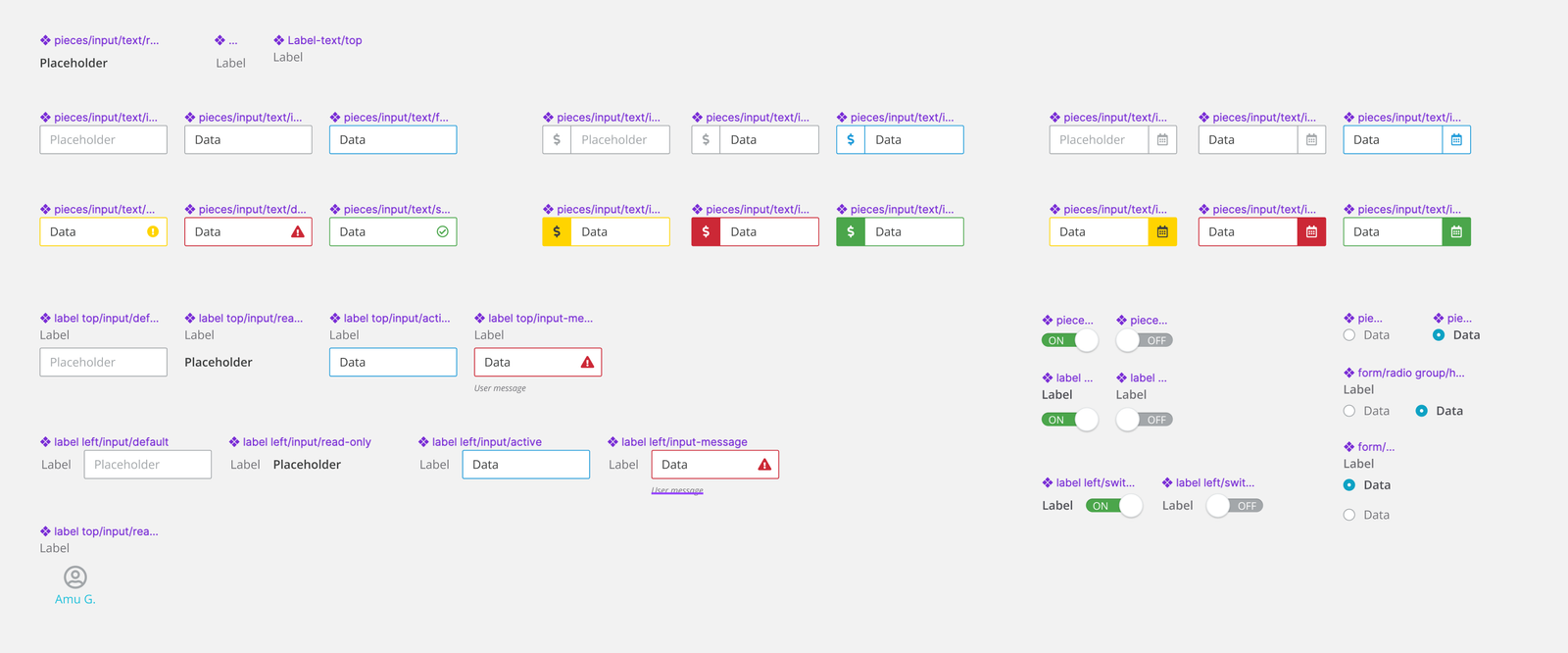
I started with a thorough analysis, working closely with the Product Management team. We looked at all page layouts, colors, existing text styles, form elements, and buttons. This deep dive showed a basic text setup, messy color palette, and no clear design system.
Focusing on what matters: Forms, layout, and buttons
Working with the Product Management leader, a former colleague who trusted my skills, we chose three main areas to improve:
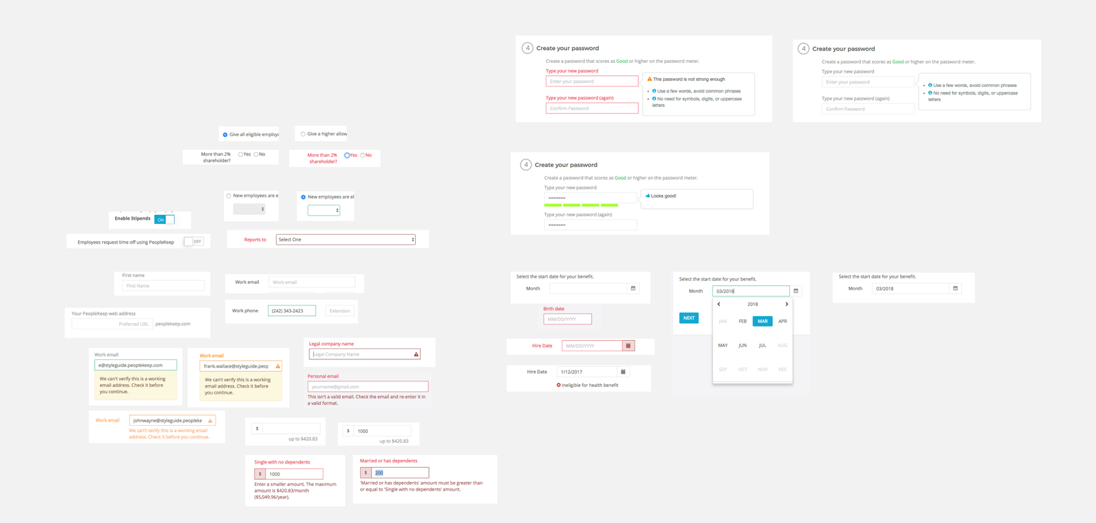
- Form elements and states
- Page layout
- Button styling
These areas would give the biggest boost to usability and brand alignment.


Building a foundation: Mixing brand with Material Design
Since PeopleKeep had lost their in-house designer, I led the research and design decisions. I updated the color palette and text styles to match their new brand. I also made sure these changes fit with Material Design, which their engineering team was using as a guide.
Step-by-step approach: Balancing goals with resources
Knowing PeopleKeep had limited resources, I planned for a gradual rollout. After talking with the Product Management and Engineering leaders, I broke the changes into manageable parts. This let their small but quick team make improvements bit by bit.
More than looks: Making things easier to maintain
My suggestions went beyond just making things look better. By finding common patterns and reusable design elements, we made it much easier to maintain their component library. This streamlining would save time and effort for the development team in the long run.


Results and unexpected changes
The PeopleKeep leaders loved our suggestions. They saw how it could make users happier and strengthen their brand. I delivered updated designs and helped plan how to put them in place.
Sadly, due to issues unrelated to this project, PeopleKeep faced some leadership changes and closed down soon after our work finished. While we couldn’t see the long-term impact, the initial response to our work was very positive.
Lessons learned: The power of trust and teamwork
This project shows how important good relationships and teamwork are when working on tight deadlines. Key takeaways for me included:
- Trust speeds things up: My history with the Product Management leader led to quick decisions and freedom to work.
- Teamwork is crucial: Working closely with product and engineering teams ensured practical and impactful changes.
- Simplifying has power: Cutting colors from 172 to 5 and streamlining text styles can greatly improve usability and maintenance.
While we couldn’t measure long-term impact due to the company closing, this project showed how focused design work can greatly improve usability, brand alignment, and development efficiency—even in just three weeks.