From paper to digital: Streamlining global student registration
We faced a cumbersome, error-prone registration system for our Seminary program—a religious scripture study class. Parents filled out paper forms, local leaders managed logistics, and Church staff grappled with manual data entry. We needed a smoother, more efficient way to register students globally.
I led the design of a responsive, web-based registration tool available in 11 languages at launch. Our goal: Make registration so simple that parents could complete it in under a minute on a mobile phone.
As the UX Lead, I:
- Conducted guerrilla user interviews to understand parent and local leader needs
- Created wireframes and a simplified user journey map to visualize the registration flow
- Collaborated closely with developers to ensure a performant, user-friendly experience
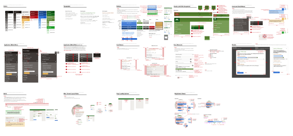
- Developed “D.I.G.“ (Design Implementation Guidelines)—an early version of a design system—to streamline communication with the engineering team
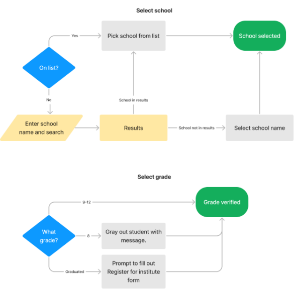

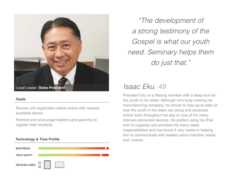
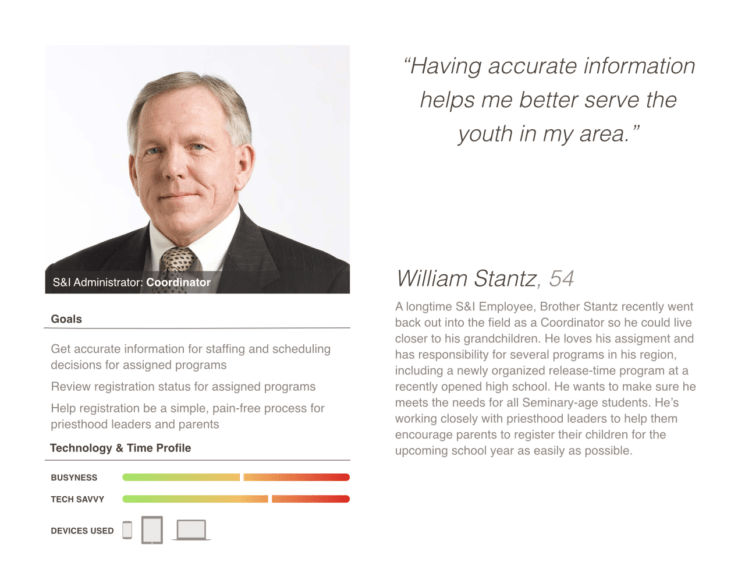
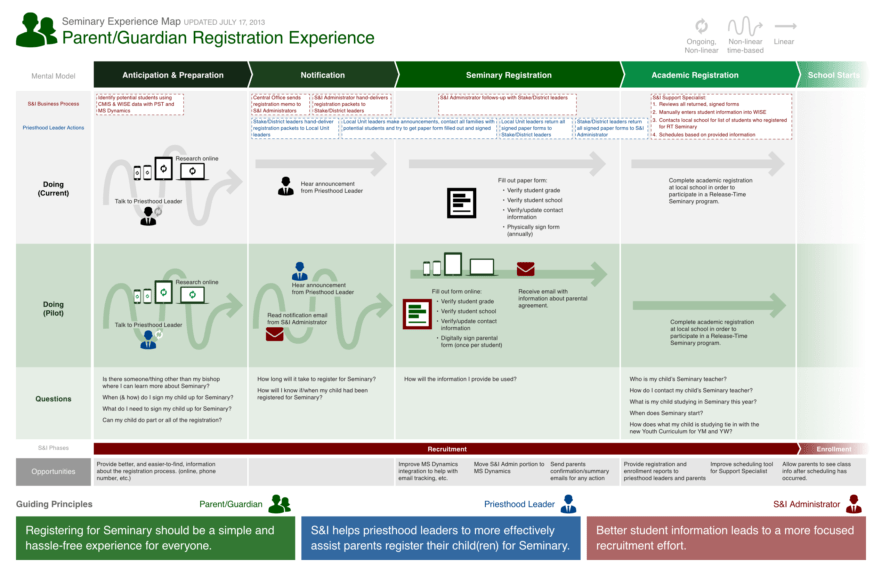
Given our tight 3-4 month timeline, we had to move fast. I spent two weeks on rapid user research, creating personas and a journey map. Key insights emerged:
- Globally, parents were busy and often only had access to mobile phones
- We needed to support registering multiple students at once
- Pre-populating data could speed up the process
- Local leaders wanted to monitor registration progress
These insights drove our design decisions, focusing on a mobile-first, efficient experience.
Rapid adoption: Exceeding global registration targets
The project launched on time and was a resounding success:
- Registered 75% of the 120,000 targeted students within 6 weeks
- Within 9 months, we saw a 250% increase in registrations (over 300,000 students – more than 75% of all eligible students worldwide)
- The leadership dashboard, almost cut from the project, became a hugely popular feature
One comment I heard repeatedly: “It was so easy! We were done and had everyone registered in a week. I loved it!”
User-centered design: Transforming global processes
Key learnings for me from this transformative project:
- Even limited user research can dramatically boost outcomes and user satisfaction in global projects
- Strong UX leadership requires creating a collaborative team environment, ensuring clear cross-functional communication, and proactively addressing challenges across cultural boundaries
- Simplifying complex processes can lead to unexpected benefits and user enthusiasm, regardless of geographical location
This project exemplified the transformative power of user-centered design, turning a tedious, paper-based, global process into a seamless experience that streamlined registration and exceeded business goals across multiple countries and languages.
